...
(See LogoContest or LogoContestEntries)
Wiki Markup
...
Note: please sign your comments. Otherwise it may appear that you're speaking in an 'official' capacity for the SpamAssassin project, which is not likely to be the case.
...
1.0.2 - I think this combines a lot of good qualities:BR
- It's "professional"-looking enough that a sysadmin for a large company could use itBR
- It's not too "scary"-looking (some of the sniper images are a little chilling)BR
- Ba Blakely has posted mixed-case versions on http://www.bablakely.com/SALogos/ BR
I vote for the mixed-case version at the URL on the previous line (not the "SA" logo, though - the two-letter acronym "SA" is too overloaded.)BR
1.0.3 - Mark Allen c/o Richard Humphrey, second image (target mark) – It's simple, neutral (most likely not offensive to anyone) and an international symbol (the target mark that is). – DanielKnippers
...
1.0.24 - I like it! The only thing I'd change is the orange e-mails... the colour seems to clash with everything else. – HenryStern
Wiki Markup
1.0.31 - The e-mail ninja is a very neat idea. I really don't like the fonts, though. See where you can go with it! – HenryStern
...
One potential way of illustrating the concept of selective filtering would be showing a ninja/assassin (or perhaps just his/her sword) cutting a certain mail in half while letting another one safely by. Of course, this somehow needs to look like a decision by the ninja/assassin/sword to kill some while letting some pass, and not just that they're overwhelmed with enemies, or else we would be sending the wrong message on the server resources SA requires. Perhaps the assassin could motion for one piece mail to pass while skewering the other one. Just a thought from a graphically-unskilled fan of the software. - DanKohn
Wiki Markup
I'm personally not too keen on the violent imagery in a lot of the logos (such as the crosshairs). Considering the militant nature of a lot of anti-spam crusaders, I think that a logo with violent imagery would reflect poorly on our project and may cause people to associate us with the more militant folks. I'd like to see some more fun entries, like the old rubber ninja logo. (HenryStern)
...
Expanding on Dan Kohn's comments, in addition to keeping a light "assassin/ninja" theme, a successful logo should immediately convey the concept of "filtering email." I do not know what would work well, but a few graphical concepts come to mind, shown below: -MichaelDouma
attachment:md-concepts.png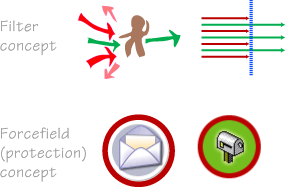
Voting Procedure
...