Logo Contest Tiebreaker Entries
(see LogoContest for details, LogoContestEntries for the first-round entries, and LogoContestDiscussion for, well, discussion)
Michael Douma
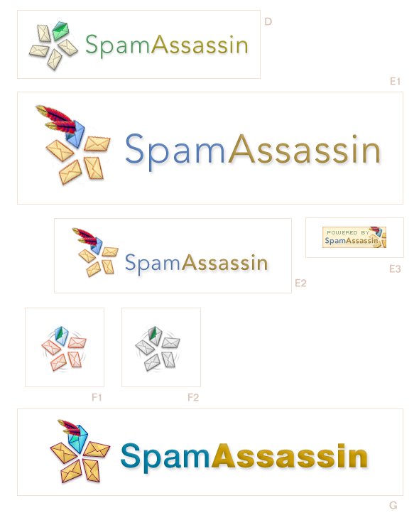
A shuriken made of rotated emails. Coloration shows filtering one email ham from the spam. Version E adds apache feathers for continuity with the apache theme, and to lend a sense of flight. Also, in version E, the shuriken is rotated as if it were a running man (subtle). Other sizes and badge layouts can be readily prepared. contact: spamassassinLogo@michaeldouma.com
Christian Rauh
- Version Rollback v. 4.x*
![]()
4.0 - Original
4.1 - Assassin deemphasized (not bold), spam envelope red, both good mail envelopes green, horizontal feathers, no arrow tapering at the end (not much tapering actually)
4.2 - Same as above but thinner envelope lines, thinner and ligther blue arrow, light font.
- No Negative Kerning v5.2*
![]()
- Negative Kerning v5.2*
![]()
- A few comments*
The logo conveys mainly:
-
- Selection
- Dynamism
- Email vs. spam
- Assassin(ation) of the spam
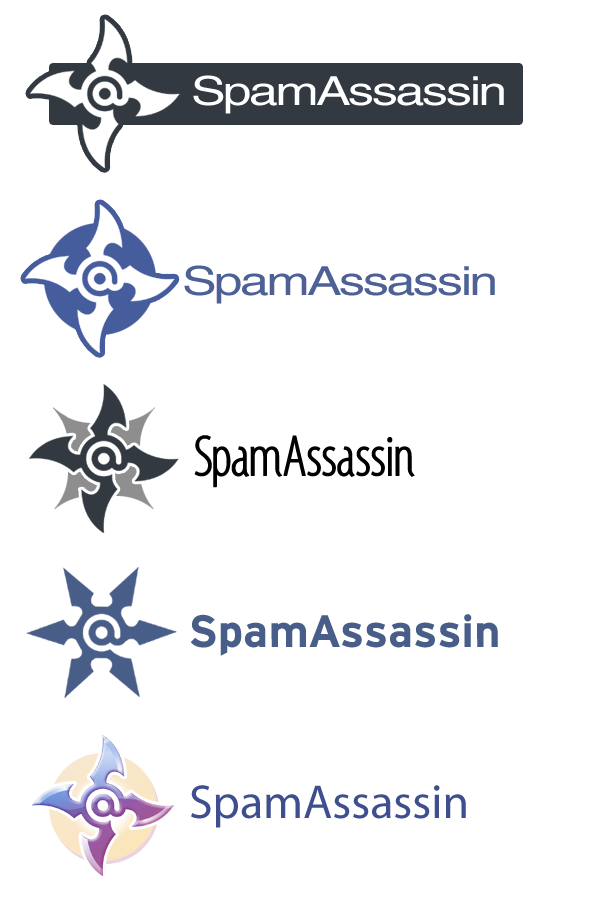
- Apache*
It uses the arrow element that is both a ninja and an apache weapon therefore tying up the previous concept with the new project affiliation. The apache feather with its distinct colors has been used in the manufacturing of the arrow, suggesting clearly but unobtrusively the identity of the umbrella project.
The logo is easily understandable by everyone. The arrow is a much more common and recognizable object than a shuriken at all age groups and user backgrounds. The letters/envelopes are a widely used metaphor for email and the red/brownish/darker envelope in contrast with the green ones clearly indicate the (evil) spam being targeted.
The visual style used is appealing to a broad target audience, it is illustrated but not too cartoonish or "gamish".
The SpamAssassin name is rendered as requested, one word with initial caps. This is a good choice to keep because when it comes to search engines queries, SpamAssassin should only bring up this software if the TM people are doing their job.
Finally, the logo is modern, professional and non-violent.
Obs:
1 - I have tried a couple of different combinations for the spam envelope color and the SpamAssassin logotype (I like the one with the gradient most). Colors preferences are too personal to guess, so keep in mind that colors are simple to change in order to suit a particular palette. The blue background colors were chosen to suggest a 'nocturnal' ambiance.
2 - The font used is Helvetica so, as far as I know, there should be no need for licensing.
3 - The negative kerning logotype design was somewhat inspired by a previous contestant entry, Thomas Wild. I have contacted him about it but got no reply, credit should be given to him anyway.
4 - The logo can be adapted to the smaller formats of buttons and badges by using part of it (arrow piercing one email), like suggested by someone in a previous post. Actually, I just tested scaling the whole thing down and it would still work with minor pixel adjustments.
5 - There was some consideration about maintaining the branding image that has been built. Well, in my opinion there isn't much of a true branding for SpamAssassin. I have had contact with the software for quite some long time as a user and it wasn't until this contest that I found out that it had anything to do with ninjas. I would strongly agree with Michael Douma about the stress of "rebranding" and would advice you to try to choose the logo that better represents the new state of the project and that also offers future opportunities for development.
4 - The logo is all vector so it can be scaled to very large sizes. Those would be some nice t-shirts, were is mine? ![]()
I think all the finalists put great work out.
Thanks,
Christian
Contact me at <salogo@rauh.net>
- Previous versions*
http://wiki.apache.org/spamassassin-data/attachments/LogoContestEntries/attachments/rauh-logo.png
http://wiki.apache.org/spamassassin-data/attachments/LogoContestEntries/attachments/rauh-logo2.png
http://wiki.apache.org/spamassassin-data/attachments/LogoContestEntries/attachments/rauh-logo4.png
Walter Kobylanski
We can provide it in any format you need. These are just other options that we suggest. You can see that the *logo* has not changed but we wanted to show you that it can be used in very different ways.
(walter at studio.st)